Love in a Digital Age
People & Place · 1 November, 2019
We are in an age of unforeseen connectivity where we are intimately linked to portable computers with the power to enrich our daily lives. However, so many of our interactions with technology are unrewarding, lack real meaning for where we are & how we feel as humans.
In this project we were tasked with designing an innovative native app which improves the lives of its target users by addressing a phenomenon we can not evade; love in a digital age.
For this project we decided to focus on the topic of finding love.
Order from Chaos
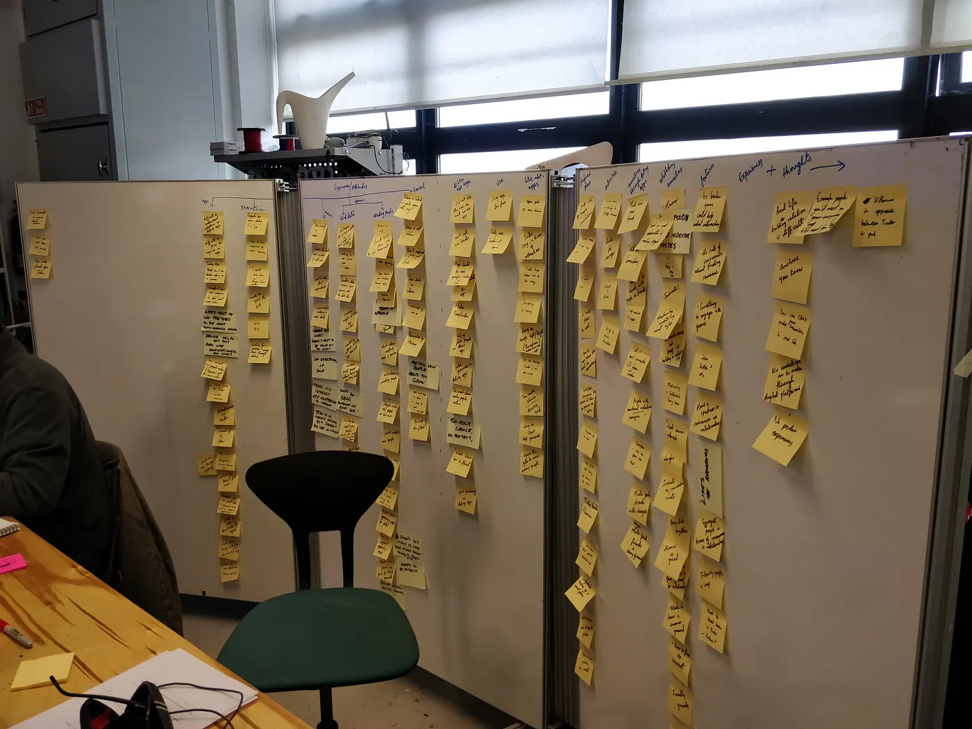
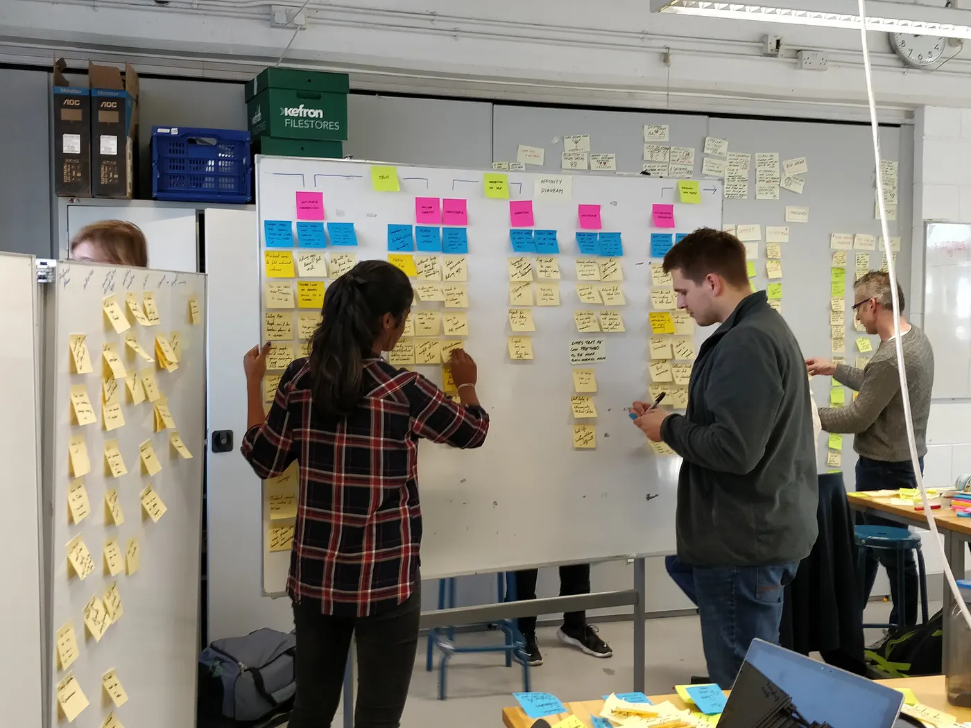
Starting with secondary research, we identified existing trends & applications for our design challenge. Next, we performed some user research, conducting interviews & observeing our targeted users.
We identified themes, insights & opportunities throughout the findings, saturating our workspace with post-its before orgainising it into an affinity diagram.
Having some Empathy
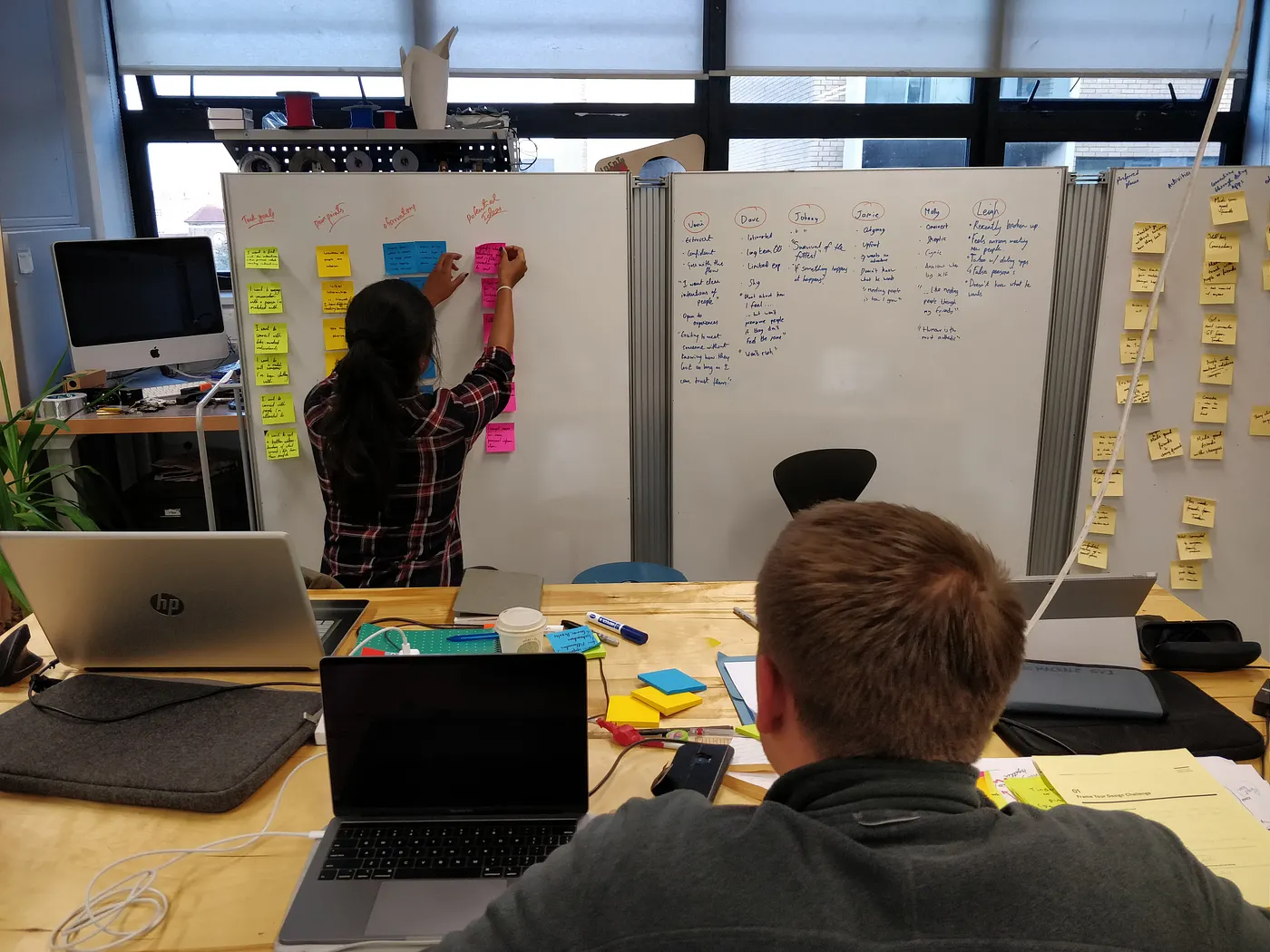
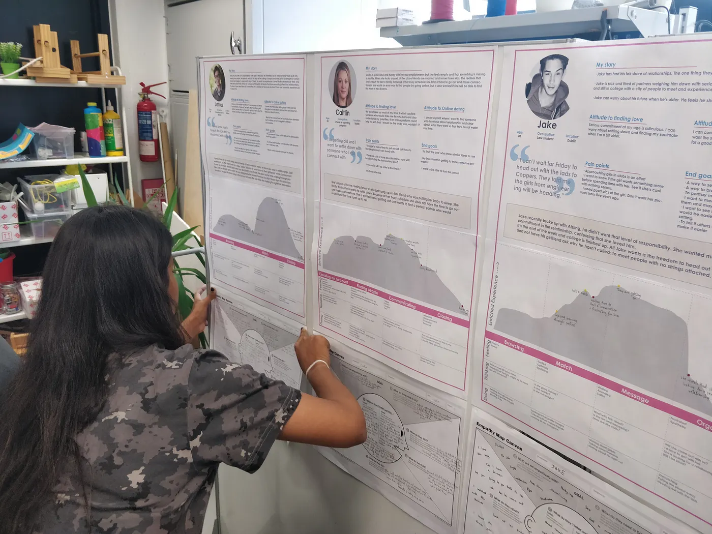
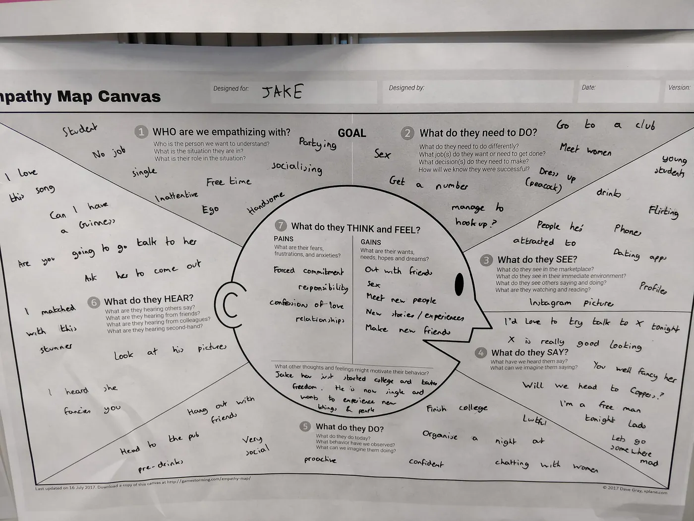
Having structured our insights, we began to come up with basic archetypes through which to categorise our users & their goals.
Using prsonas, scenarios, user journey maps & empathy maps, we learned how to extract actionable, key insights on our users:
- After making a connection, we struggle to initiate conversation.
- We want to know what others are planning.
- We don't take things at face value online.
- We can never truly get to know someone online.
Setup for Success
Breaking off from ours groups, it was time to start thinking about the app's direction. To help with this, I came up with six design principles to maintain consistency:
- Minimalist → doing more with less (Hick's Law).
- Unified → recognisable, repeatable, reusable solutuions (components).
- Trustworthy → efforts for transparency (catfishing & intentions).
- Ice breaking → providing the tools to initiate interactions & crutches to keep them going.
- Evocative → focus on creating instense points & moments.
- Fun → engagement in play.
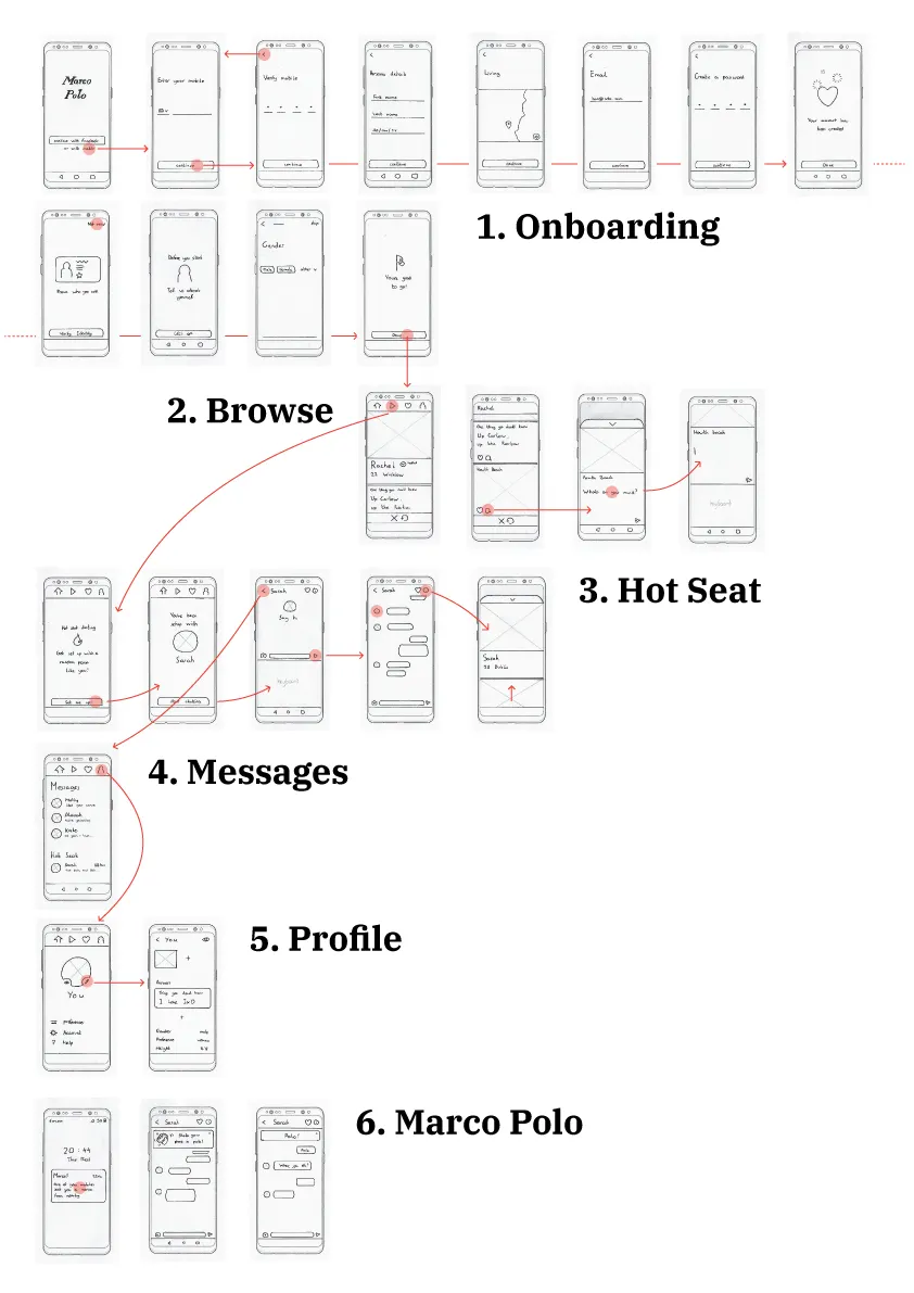
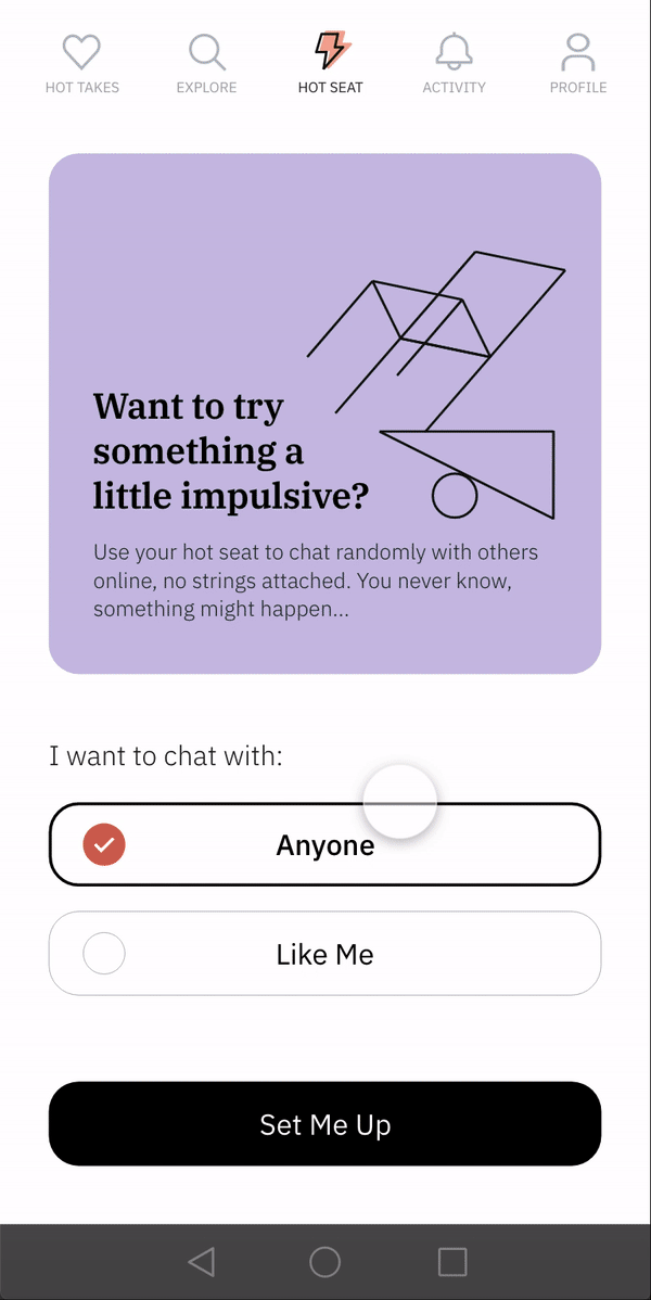
Marco Polo
The first iteration employed a fast, iterative & prototype driven design phase accompained by lots of testing. I ideated & defined key features, constantly asking "how might I…?".
The aim was to conceptualise fluidly on paper, testing in context as I went in order to produce greater levels of fidelity, refining my features & ideas.
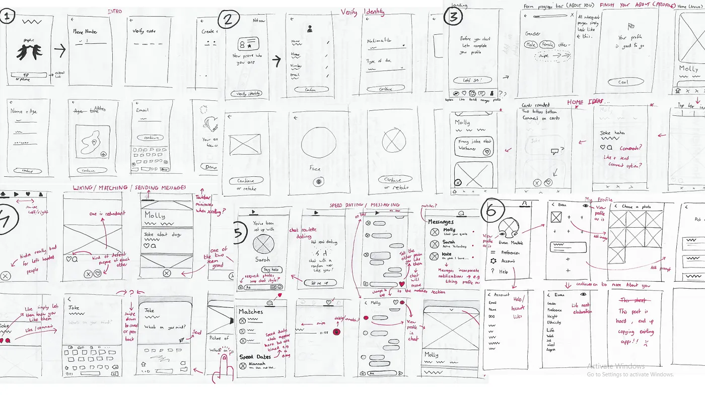
I settled on my first idea named Marco Polo. As you can imagine, this would include a Marco Polo inspired game for finding your date with a phone!
Before starting, both users would agree on a rough area (map radius) to meet up in. Then, shaking one phone would signal another to activate it's motor/actuator, varying in intesity based on proxminity. The would be lovers take part in a game of hide & seek to break the ice & maybe create a few memories along the way.
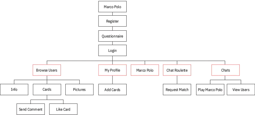
The primary feature would lie in a user's profile or "feed". Commenting or liking a user's content will send a match request. Futher features would include a chatroulette, messaging, profiles & the Marco Polo game.
Everybody Hates Marco
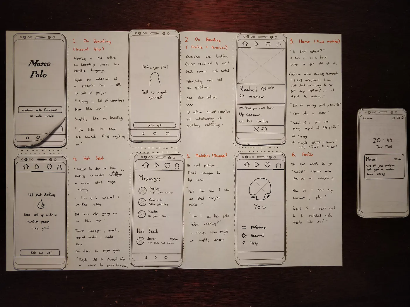
It became clear from the user testing that Marco Polo wouldn't succeed in a dating app. It was way too creepy.
I found also that the onboarding needed to be simplified, user profiles were lacking engaging content & my system of liking/commenting on user profile 'cards' was confusing.
The gamification, albeit a failure, was recieved positively as an idea. I still wanted to work on a feature that might evoke an emotional response; Incentivising users to break that ice.
Workshop Time
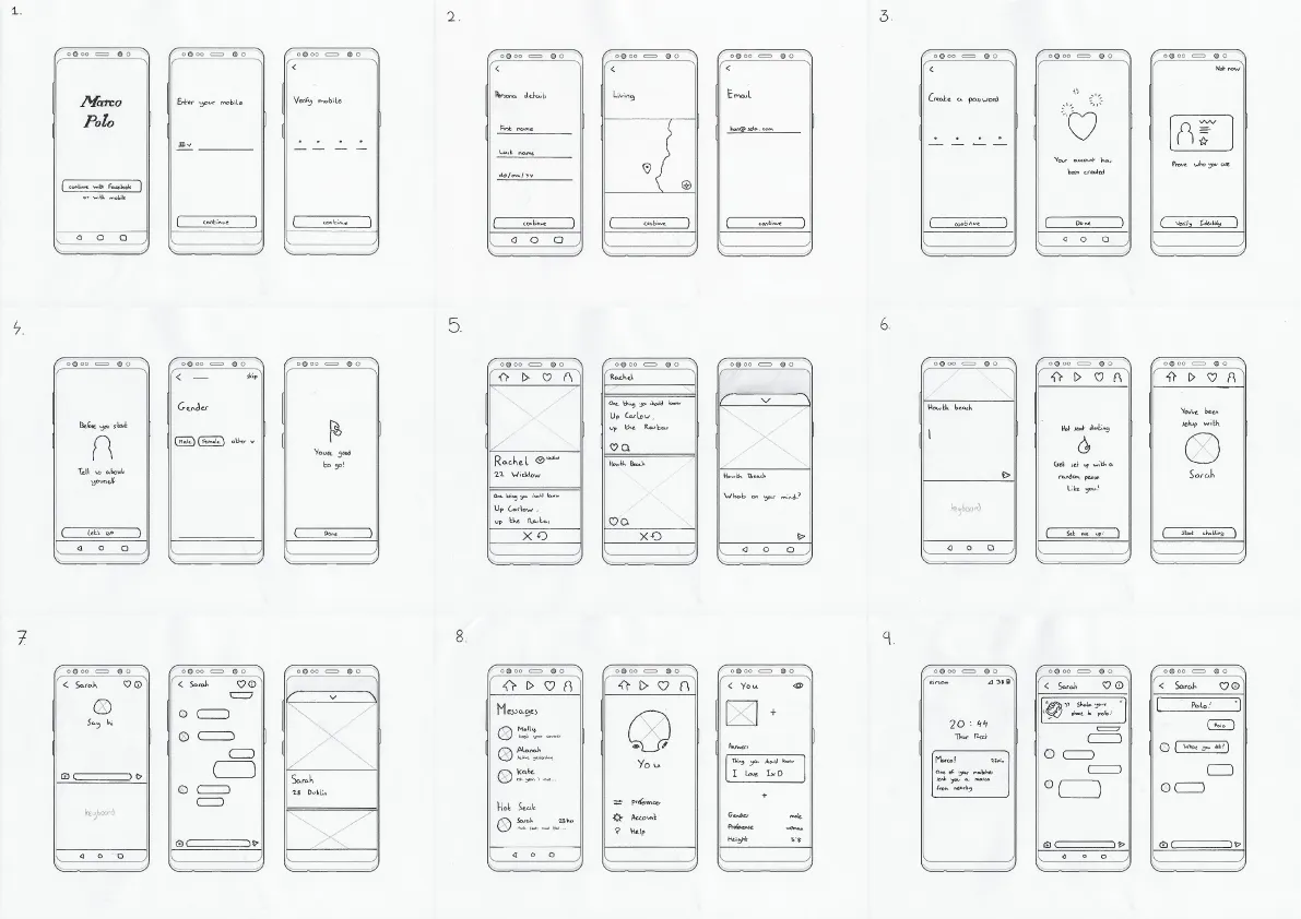
At this point, it was time to focus on shifting our iterations to a digital format. We were fortunate to have Michell Mulvey from Fjord running a full day workshop with us on interactive prototyping in Adobe XD & Figma.
Over the next few days we worked with design systems, component libraries, patterns, colour, typography, & my absolute favourite: responsive grid systems!
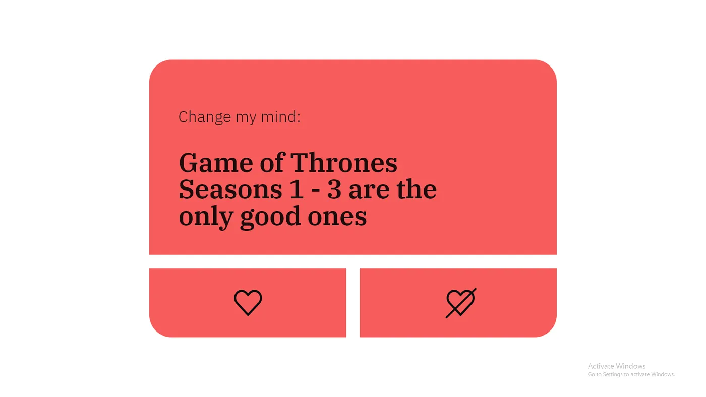
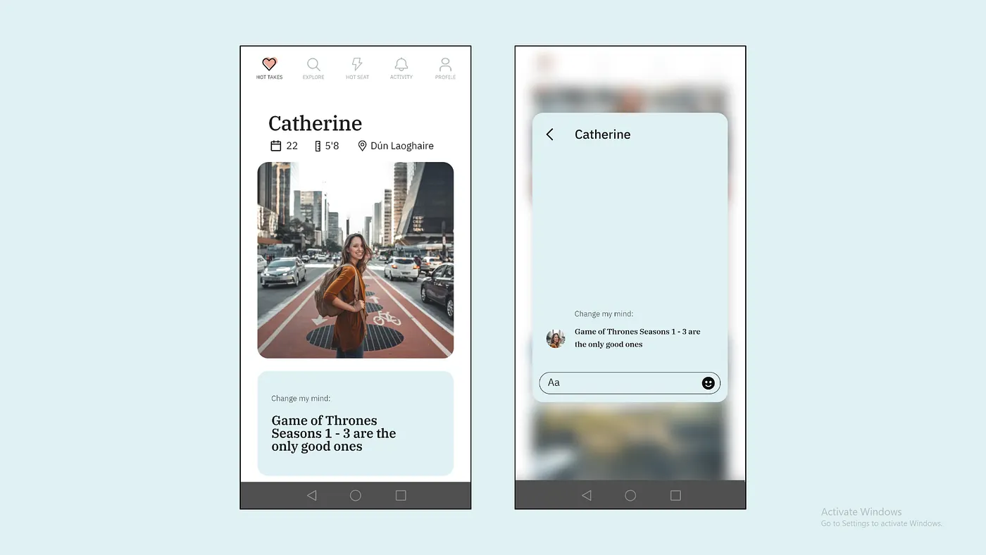
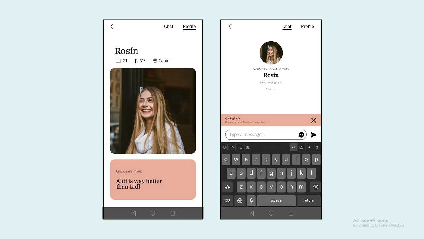
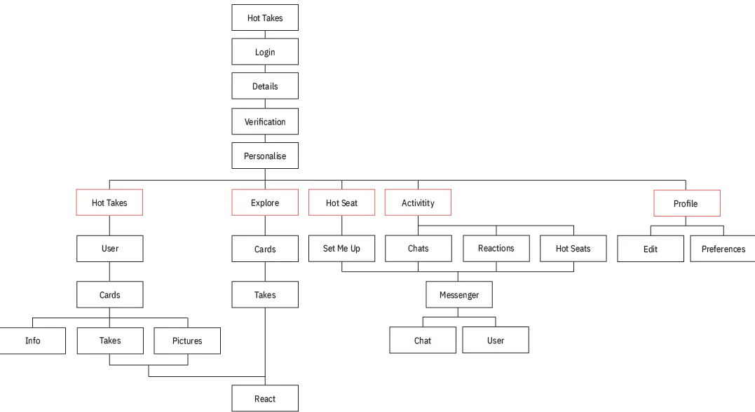
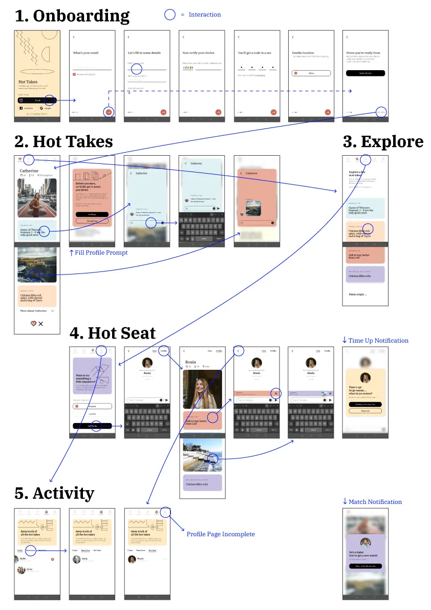
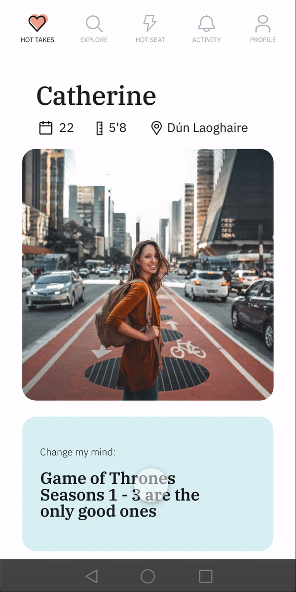
Hot Takes
In the previous iteration, the gamification (albeit a failure) was recieved positively as an idea. I needed something that might evoke an emotional response; Incentivising users to break the ice. In the end, I came up with a "change my mind" feature:
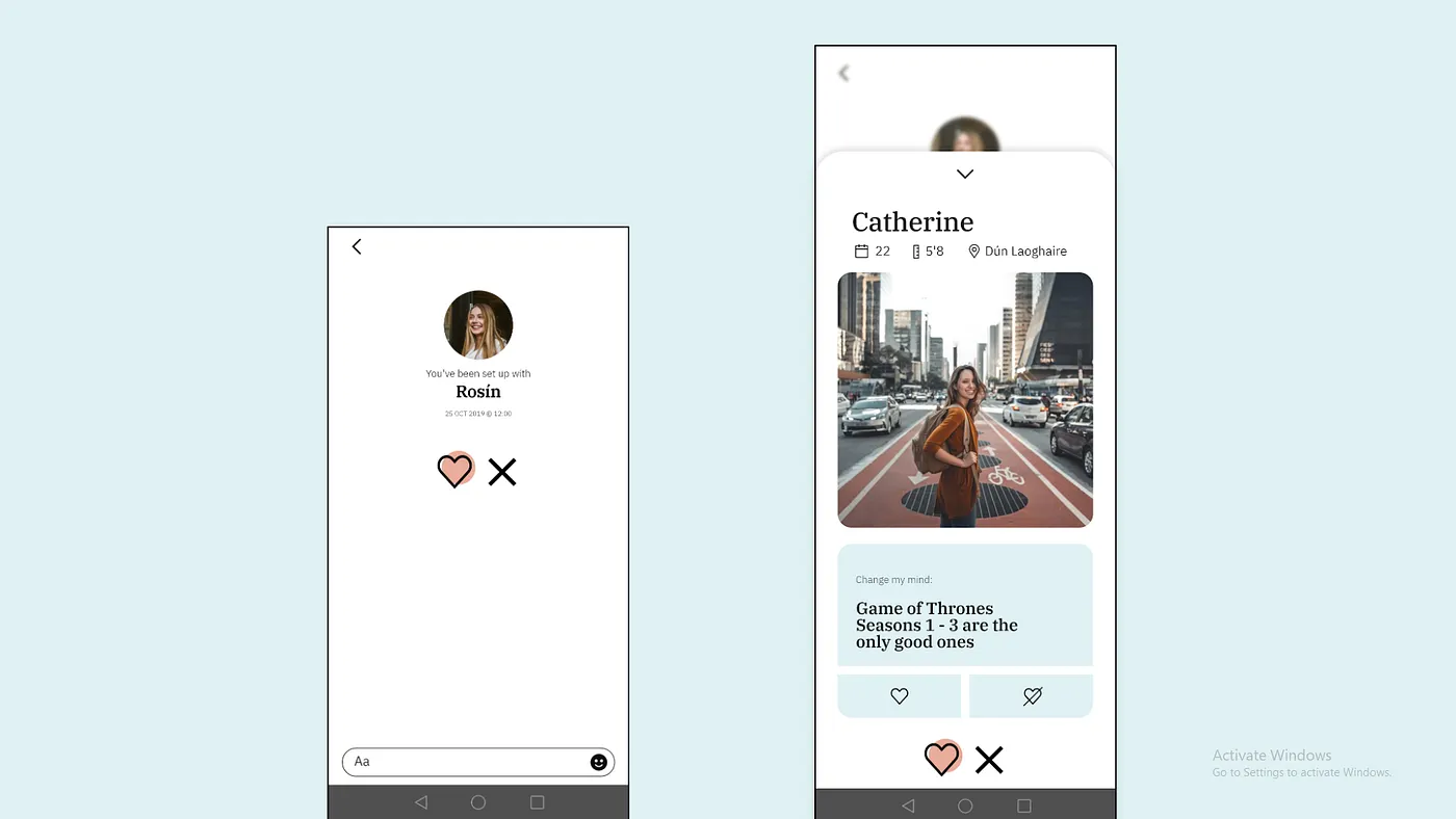
When testing this iteration, I realised that I had created a complicated Tinder. There were too many yes/no options. To tackle this, I removed the liking system & instead chose to prompt users to share their own opinions, & by extension, start a conversation.
I was, very simply, allowing my users to have a go at their own hot takes.
"A superficially researched & hastily written piece that presents opinions as facts & is often moralistic."
Hot Takes was born.
Learning
The first two weeks of this project were spent learning how to research & design from scratch. I learned how to unpack the broad topic of how people feel about finding love online. The many insights were used frame users as archetypes I could empathise with & re-evaluate my designs through each iteration.
Personas make a huge difference in longer projects like this. I appreciated them even more as I began to digitise my work, making room for less testing & longer periods of building. They're a nice, human centred reminder of what I saw & heard, what it means & why it matters.
Moving onto to digital prototyping was an absolute joy. Taking up something like Figma & building a fully interactive "fake" app to test with was mind blowing. With the help of people around me I was able to quickly build stuff & test & test & test. As a software engineer, I always loved grids & modularity. It was liberating to say the least, to be given so much time to play with layout & colour.